
One of the most annoying experiences for a user is to forget their password.
To make it even more aggravating, some reset password flows are so badly designed that the user would just think of not using the application again.
Therefore, it is really crucial to have a solid UX for the password reset process. This is one of the problems that I encountered while building Libertas, an online discussion platform, built with Next.js.
Hence, I surfed on the internet and got inspired by this article.
Below is how I created a password reset flow in Next.js and how you can do it too.
But first…
How a Password Reset Flow should look like?

Ideally, the password reset flow should have 5 steps that are pretty straightforward. They are listed below:
1. “Forgot password?” link
2. Type email, get an email with a password reset link

3. Click the link, go to “Reset Password” page

4. Type and confirm the new password

5. Authenticate with the new password

For the final step, some would argue that why not just get the user automatically signed in after confirming their new password. But maybe this is largely avoided just to add an additional layer of security.
Steps to implement password reset flow in Next.js
1. Create a Next.js app
Type the following command:
npx create-next-app@latest
2. Create a Login page

Code:
"use client";
import ErrorText from "@/components/errorComponents/ErrorText";
import LoadingButton from "@/components/pageComponents/LoadingButton";
import { GlobalContext } from "@/services/globalContext";
import { Button, Stack } from "@mui/material";
import Link from "next/link";
import { useContext, useEffect, useState } from "react";
import TextInput from "../../components/formComponents/TextInput";
import { useRouter } from "next/navigation";
import { colors } from "@/theme/colors";
import PasswordInput from "@/components/formComponents/PasswordInput";
import TitleText from "@/components/pageComponents/TitleText";
const Login = () => {
const { loading, login, loginError, user } = useContext(GlobalContext);
const [email, setEmail] = useState("");
const [password, setPassword] = useState("");
const router = useRouter();
const submitHandler = (e) => {
e.preventDefault();
// console.log(email, password);
login(email, password);
};
useEffect(() => {
if (user) {
router.push("/feed");
}
}, [user]);
useEffect(() => {
document.title = `Login | Libertas`;
}, []);
return (
<div
style={{ display: "flex", justifyContent: "center", padding: "4rem 0" }}
>
<div>
<TitleText title="Login" text="Sign in to your account on Libertas" />
<form onSubmit={submitHandler}>
<Stack spacing={2} style={{ textAlign: "center" }}>
{loginError && <ErrorText message={loginError} />}
<TextInput
type="email"
placeholder="Email"
value={email}
onChange={(e) => setEmail(e.target.value)}
required={true}
/>
<PasswordInput
password={password}
handlePassword={(e) => setPassword(e.target.value)}
showCapsLockOnMessage={true}
/>
<Stack alignItems="flex-end" style={{ marginTop: 8 }}>
<Link
href="/recover-password"
style={{
fontSize: "0.875rem",
color: "#000",
textDecoration: "underline",
}}
>
Forgot password?
</Link>
</Stack>
<Button
variant="contained"
type="submit"
style={{
textTransform: "capitalize",
backgroundColor: colors.button.background,
fontWeight: "600",
borderRadius: "0rem",
marginTop: 30,
}}
>
Login
{loading && (
<div style={{ marginLeft: "0.6rem" }}>
<LoadingButton />
</div>
)}
</Button>
<p style={{ textAlign: "center", fontSize: "0.875rem" }}>
Don't have an account?{" "}
<Link
href="/sign-up"
style={{ color: "#000", textDecoration: "underline" }}
>
Sign up
</Link>
</p>
</Stack>
</form>
</div>
</div>
);
};
export default Login;
TextInput component:
import { TextField } from "@mui/material";
import React from "react";

const TextInput = ({
  type,
  placeholder,
  value,
  onChange,
  required,
  nameOfInput,
}) => {
  return (
    <TextField
      type={type}
      label={placeholder}
      value={value}
      onChange={onChange}
      fullWidth
      required={required ? required : false}
      size="small"
      name={nameOfInput}
    />
  );
};
export default TextInput;
PasswordInput component:
import { faCircleInfo } from "@fortawesome/free-solid-svg-icons";
import { FontAwesomeIcon } from "@fortawesome/react-fontawesome";
import { Visibility, VisibilityOff } from "@mui/icons-material";
import { IconButton, InputAdornment, Stack, TextField } from "@mui/material";
import { useState } from "react";

const PasswordInput = ({ password, handlePassword, showCapsLockOnMessage }) => {
  const [showPassword, setShowPassword] = useState(false);
  const [capsLockOnMessage, setCapsLockOnMessage] = useState("");

  const handleClickShowPassword = () => {
    setShowPassword(!showPassword);
  };

  // detect if caps lock is on
  const handleKeyUp = (e) => {
    const capsLockOn = e.getModifierState("CapsLock");

    if (capsLockOn) {
      setCapsLockOnMessage("Caps Lock is on");
    } else {
      setCapsLockOnMessage("");
    }
  };

  return (
    <Stack alignItems="flex-start" spacing={1}>
      <TextField
        size="small"
        type={showPassword ? "text" : "password"}
        label="Password"
        value={password}
        onChange={handlePassword}
        required={true}
        InputProps={{
          endAdornment: (
            <InputAdornment position="end">
              <IconButton
                aria-label="toggle password visibility"
                onClick={handleClickShowPassword}
                edge="end"
              >
                {showPassword ? <VisibilityOff /> : <Visibility />}
              </IconButton>
            </InputAdornment>
          ),
        }}
        fullWidth
        onKeyUp={handleKeyUp}
      />
      {showCapsLockOnMessage && !!capsLockOnMessage && (
        <Stack direction="row" alignItems="center" spacing={1}>
          <FontAwesomeIcon icon={faCircleInfo} />
          <p style={{ fontSize: "0.875rem" }}>{capsLockOnMessage}</p>
        </Stack>
      )}
    </Stack>
  );
};

export default PasswordInput;
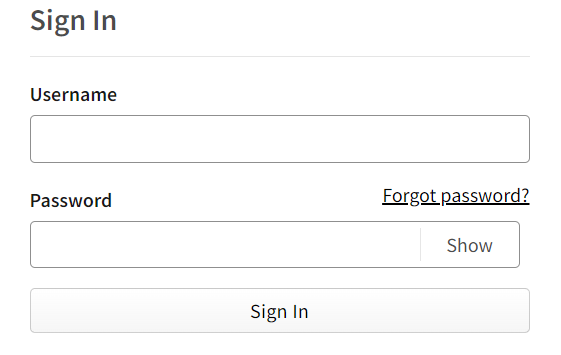
3. Add the “Forgot password?” link
Then an email will pop up on the user’s Gmail account.
<Link
  href="/recover-password"
  style={{
    fontSize: "0.875rem",
    color: "#000",
    textDecoration: "underline",
  }}
>
  Forgot password?
</Link>
I have used a <Link> component of Next.js, which on clicking, goes to “/recover-password” page.

4. Create a Forgot Password page

Code:
"use client";
import ErrorText from "@/components/errorComponents/ErrorText";
import TextInput from "@/components/formComponents/TextInput";
import LoadingButton from "@/components/pageComponents/LoadingButton";
import TitleText from "@/components/pageComponents/TitleText";
import { GlobalContext } from "@/services/globalContext";
import { colors } from "@/theme/colors";
import { Button, Stack } from "@mui/material";
import { useContext, useEffect, useState } from "react";

const RecoverPassword = () => {
  const { loading, passwordRecoveryEmailError, sendPasswordRecoveryEmail } =
    useContext(GlobalContext);

  const [emailOrUsername, setEmailOrUsername] = useState("");

  const submitHandler = (e) => {
    e.preventDefault();

    sendPasswordRecoveryEmail(emailOrUsername);
  };

  const isButtonDisabled = !emailOrUsername;

  return (
    <div
      style={{ display: "flex", justifyContent: "center", padding: "4rem 0" }}
    >
      <div>
        <TitleText
          title="Recover Password"
          text="It's okay, we have got this!"
        />

        <form onSubmit={submitHandler}>
          <Stack spacing={2} style={{ textAlign: "center" }}>
            {passwordRecoveryEmailError && (
              <ErrorText message={passwordRecoveryEmailError} />
            )}
            <TextInput
              type="text"
              placeholder="Email or username"
              value={emailOrUsername}
              onChange={(e) => setEmailOrUsername(e.target.value)}
              required={true}
            />
            <Button
              variant="contained"
              type="submit"
              style={{
                textTransform: "none",
                backgroundColor: colors.button.background,
                fontWeight: "600",
                borderRadius: "0rem",
              }}
              sx={{
                "&.Mui-disabled": {
                  color: "grey",
                },
              }}
              disabled={isButtonDisabled}
            >
              Send me a reset password email
              {loading && (
                <div style={{ marginLeft: "0.6rem" }}>
                  <LoadingButton />
                </div>
              )}
            </Button>
          </Stack>
        </form>
      </div>
    </div>
  );
};

export default RecoverPassword;
sendPasswordRecoveryEmail function is in the next step.
5. Send the “Change Password” mail to the user
To send the email to the user, I used nodemailer package in my Node.js/Express backend.
a. Install nodemailer
With npm
npm i nodemailer
With yarn
yarn add nodemailer
b. Setup nodemailer
I have used “Gmail” as the service, so before creating the controller to send password recovery email to the user in their Gmail account, I had to setup nodemailer with the help of this page.
c. Create the controller to send email to the user
const sendPasswordRecoveryEmail = asyncHandler(async (req, res, next) => {
  const { emailOrUsername } = req.body;

  if (!emailOrUsername) {
    res.status(400);
    return next(new Error("Field is required"));
  }

  // Find the user
  let userAvailable;
  if (emailOrUsername.includes("@")) {
    userAvailable = await UserModel.findOne({ email: emailOrUsername });
  } else {
    userAvailable = await UserModel.findOne({ username: emailOrUsername });
  }

  if (!userAvailable) {
    res.status(400);
    return next(new Error("User is not found"));
  }

  const html = `
    <p>Hi, ${userAvailable.name},</p>
    <p>Here's your password recovery link</p>
    <a href="https://libertas-vert.vercel.app/reset-password/${userAvailable._id}">Reset password here</a>
    <p>Best regards, Libertas</p>
  `;

  const transporter = nodemailer.createTransport({
    service: "gmail",
    auth: {
      user: process.env.GOOGLE_ACCOUNT_USER,
      pass: process.env.GOOGLE_ACCOUNT_PASS,
    },
  });

  if (userAvailable) {
    // sending email with nodemailer
    const info = await transporter.sendMail({
      from: '"Libertas" <libertas.discussion@gmail.com>', // sender address
      to: userAvailable.email,
      subject: `Reset your Libertas password`, // Subject line
      html: html, // html body
    });

    res.status(201).json({
      success: true,
      message: "Password recovery email has been sent succesfully",
      id: userAvailable._id,
      email: userAvailable.email,
      info: info,
    });
  } else {
    res.status(400);
    return next(new Error("Something went wrong!"));
  }
});
In the above code:
I am allowing the user to type either their “username” or “email”.
const { emailOrUsername } = req.body;
- I am checking if the user with that email or username exists in the database. If not, I throw an error.
// Find the user
  let userAvailable;
  if (emailOrUsername.includes("@")) {
    userAvailable = await UserModel.findOne({ email: emailOrUsername });
  } else {
    userAvailable = await UserModel.findOne({ username: emailOrUsername });
  }

  if (!userAvailable) {
    res.status(400);
    return next(new Error("User is not found"));
  }
- I have created a simple html markup that will show on the email that goes into the user’s Gmail account.
const html = `
    <p>Hi, ${userAvailable.name},</p>
    <p>Here's your password recovery link</p>
    <a href="https://libertas-vert.vercel.app/reset-password/${userAvailable._id}">Reset password here</a>
    <p>Best regards, Libertas</p>
  `;
- Next, I have configured the nodemailer transporter. I have specificed “gmail” as the “service” and used my Google username and password which was setup with this.
const transporter = nodemailer.createTransport({
    service: "gmail",
    auth: {
      user: process.env.GOOGLE_ACCOUNT_USER,
      pass: process.env.GOOGLE_ACCOUNT_PASS,
    },
  });j
- If the user is available in the database, I send the mail to their Gmail account.
if (userAvailable) {
    // sending email with nodemailer
    const info = await transporter.sendMail({
      from: '"Libertas" <libertas.discussion@gmail.com>', // sender address
      to: userAvailable.email,
      subject: `Reset your Libertas password`, // Subject line
      html: html, // html body
    });

    res.status(201).json({
      success: true,
      message: "Password recovery email has been sent succesfully",
      id: userAvailable._id,
      email: userAvailable.email,
      info: info,
    });
  } else {
    res.status(400);
    return next(new Error("Something went wrong!"));
  }
About half of the code above is not necessary as typing only email will work for most users, but in Libertas, I gave the option to find the user by both their “username” and “email”.
d. The mail in action
If nodemailer works successfully, an email will pop up on the user’s Gmail account.
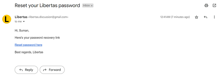
It is a good practice to let the user know about what happened when they clicked on the “Send me a password recovery email” button.
This way they won’t be left hanging.

Code for above “feedback” page is:
"use client";
import { Stack } from "@mui/material";
import Link from "next/link";
import { useEffect } from "react";

const PasswordRecoveryEmailSent = () => {
  return (
    <div
      style={{ display: "flex", justifyContent: "center", padding: "4rem 0" }}
    >
      <div>
        <Stack
          alignItems="center"
          spacing={2}
          style={{ marginBottom: "2rem", textAlign: "center" }}
        >
          <h1>Check your email</h1>
          <p>
            An email has been sent to your email address to reset your password.
          </p>
          <Link
            href="/login"
            style={{
              fontSize: "0.875rem",
              color: "#000",
              textDecoration: "underline",
            }}
          >
            Back to login
          </Link>
        </Stack>
      </div>
    </div>
  );
};

export default PasswordRecoveryEmailSent;
6. Create a “Reset Password” page
When the user clicks on the “Reset password here” link on the email, I redirect them to the the “Reset password” page where they can create a new password.

Code:
"use client";
import ErrorText from "@/components/errorComponents/ErrorText";
import TextInput from "@/components/formComponents/TextInput";
import LoadingButton from "@/components/pageComponents/LoadingButton";
import TitleText from "@/components/pageComponents/TitleText";
import { GlobalContext } from "@/services/globalContext";
import { colors } from "@/theme/colors";
import { Button, Stack } from "@mui/material";
import { useContext, useEffect, useState } from "react";

const ResetPassword = ({ params }) => {
  const [user, setUser] = useState(null);
  const [password, setPassword] = useState("");
  const [password2, setPassword2] = useState("");

  const { loading, getSpecificUser, resetUserPassword, passwordResetError } =
    useContext(GlobalContext);

  useEffect(() => {
    let mounted = true;

    const fetchUser = async () => {
      const data = await getSpecificUser(params.emailOrUsername);

      if (data?.data?.success) {
        setUser(data?.data?.user);
      }
    };

    fetchUser();

    return () => (mounted = false);
  }, []);

  const submitHandler = (e) => {
    e.preventDefault();

    resetUserPassword(user?._id, password, password2);
  };

  const isButtonDisabled = password.length > 0 && password2.length > 0;

  return (
    <div
      style={{ display: "flex", justifyContent: "center", padding: "4rem 0" }}
    >
      <div>
        <TitleText title="Reset Password" />

        <form onSubmit={submitHandler}>
          <Stack spacing={2} style={{ textAlign: "center" }}>
            {passwordResetError && <ErrorText message={passwordResetError} />}
            <TextInput
              type="password"
              placeholder="New password"
              value={password}
              onChange={(e) => setPassword(e.target.value)}
              required={true}
            />
            <TextInput
              type="password"
              placeholder="Confirm password"
              value={password2}
              onChange={(e) => setPassword2(e.target.value)}
              required={true}
            />
            <Button
              variant="contained"
              type="submit"
              style={{
                textTransform: "none",
                backgroundColor: colors.button.background,
                fontWeight: "600",
                borderRadius: "0rem",
              }}
              sx={{
                "&.Mui-disabled": {
                  color: "grey",
                },
              }}
              disabled={!isButtonDisabled}
            >
              Change Password
              {loading && (
                <div style={{ marginLeft: "0.6rem" }}>
                  <LoadingButton />
                </div>
              )}
            </Button>
          </Stack>
        </form>
      </div>
    </div>
  );
};

export default ResetPassword;
The above code contains a form that runs a submitHandler function that further calls the resetUserPassword function that resets the user’s password.
7. Create controller to reset the password on the backend
I created a resetPassword controller to read both the password and confirmPassword values, compare both and update the user details with the new password.
const resetPassword = asyncHandler(async (req, res, next) => {
  const { id, password, confirmPassword } = req.body;

  if (!password || !confirmPassword) {
    res.status(400);
    return next(new Error("Both password fields are required"));
  }

  // Find the user
  if (password !== confirmPassword) {
    res.status(400);
    return next(new Error("Passwords do not match"));
  }

  const hashedPassword = await bcrypt.hash(password, 10);

  const updateUser = await UserModel.findByIdAndUpdate(
    id,
    {
      password: hashedPassword,
    },
    {
      new: true,
    }
  );

  if (updateUser) {
    res.status(201).json({
      success: true,
      message: "Password has been reset succesfully",
      user: updateUser._id,
    });
  } else {
    res.status(400);
    return next(new Error("Something went wrong!"));
  }
});
I have takes the above controller and used in this PUT route:
router.put("/reset-password", resetPassword);
Then called the above route on the frontend.
Once the new password is validated, user will see the page below:

Code for the above page:
"use client";
import { Stack } from "@mui/material";
import Link from "next/link";
import { useEffect } from "react";
const ResetPasswordSuccess = () => {
return (
<div
style={{ display: "flex", justifyContent: "center", padding: "4rem 0" }}
>
<div>
<Stack
alignItems="center"
spacing={2}
style={{ marginBottom: "2rem", textAlign: "center" }}
>
<h1>Password successfully reset!</h1>
<p>Let's go! Your password has been changed successfully!</p>
<Link
href="/login"
style={{
fontSize: "0.875rem",
color: "#000",
textDecoration: "underline",
}}
>
Login
</Link>
</Stack>
</div>
</div>
);
};
export default ResetPasswordSuccess;
Here, you have a two choices:
- Automatically redirect the user to the “Login” page.
- Leave it upto the user about the next steps.
8. Authenticate
Final step of the reset password flow is to login with the new password.

That’s it! Was it too much? No worries, take it slow, step-by-step.
Conclusion
This post discussed how I created a password reset flow on Libertas. You can use the above process in your React/Next.js application too!
If you need any help, you can contact me on LinkedIn and Twitter. I usually try to reply fast.